Responsive web design means that your website (and its pages) can provide the best experience to users, whether on a desktop, laptop, tablet, or smartphone. For this to happen, your website needs a responsive design.
What is responsive web design?
Responsive web design, also called RWD design, describes a modern web design approach that allows websites and pages to automatically adapt to the screen, whether it’s a desktop, laptop, tablet, smartphone, or even a smart TV. Display devices and screen sizes.
As the user switches from their laptop to the iPad, the website should automatically change to accommodate resolution, image size, and text. The designer may also have to consider the user’s device settings. For example, if a user has a VPN for iOS on their iPad, the website should not block the user’s access to the page. In other words, the website must have the necessary technology to adapt to the user’s preferences and choices. This eliminates the need for different designs and development for each new device.
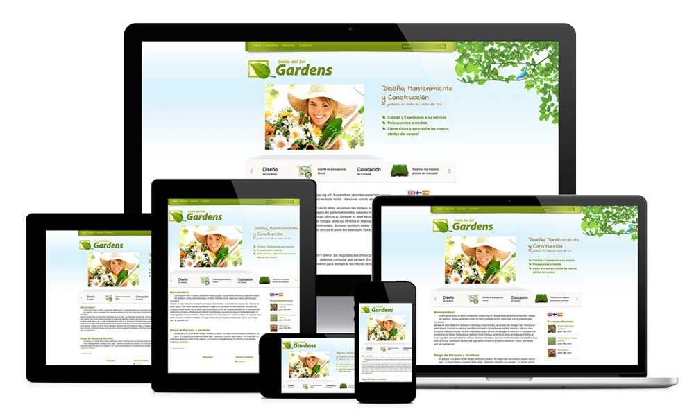
Responsive web design
Responsive web design
How does responsive web design work?
Responsive web design works through Cascading Style Sheets (CSS), using different settings to provide different styles depending on the screen size, orientation, resolution, color, and other characteristics of the user’s device. Some examples of CSS features related to responsive web design are viewport and media queries.
Why is responsive web design important for web designers and business owners?
Responsive web design frees web designers, UI designers, and web developers from working around the clock to create websites for every different device out there. It also makes life easier for business owners, marketers, and advertisers. Below are some advantages of responsive web design:
One site for all devices: Whether on a 27-inch iMac with a wireless connection or an Android phone screen, the website is configured for the user’s viewing pleasure.
Device-Optimized Design: With a responsive web design approach, all images, fonts, and other HTML elements are scaled appropriately to maximize the user’s screen size.
No need for redirects: Other design options for multiple devices require the use of redirects to send the user to the appropriate version of a web page. But in a responsive website, the user can access the content he wants to look at as quickly as possible without having to change the path.
Responsive web design is also affordable in terms of price. It is also easier for you to manage. Because you don’t have to make the changes twice, but you can work on a website and update it.
Responsive web design principles
There are three basic principles in designing responsive websites, which are:
1-Fluid network system
Old websites were based on print media such as newspapers and magazines. Columns were placed and displayed in a fixed size and position. With the arrival of mobile devices, this changed. In responsive design, instead of simply Relying on pixels, it uses percentages that adapt to different resolutions and sizes of different types of pages. Fluid or flexible networks use relative size to fit the content with the screen size of the device. Grades are based on percentages. By basing the text size, width, and margin on a percentage, a fixed size can be converted to a size relative to its display space.
2. Images and flexible media
Apart from design and text, images should also be displayed properly. Images and other media must be loaded differently for each resolution. This can be achieved through scaling (max-width property) or cropping (overflow property). With scaling, the maximum width of the image or media can be set to 100% so that the browser will scale it down or up depending on the screen. Crop, on the other hand, hides a part of the image to still show it on the screen.
3. Media questions
Known as breakpoints, they can be used to apply different styles based on what the screen can display. The website recognizes the type of device you are using and displays the content correctly. This can be seen by resizing your desktop browser to different sizes, you will understand how a responsive site is adjusted to display the best content. It can be customized to control width, height, max width, max height, device height, orientation, aspect ratio, etc.
Responsiveness test of the website
Responsiveness test of the website
Responsiveness test of the website
Every modern web designer should know the basics of responsive web design – how to make your sites render well on any device or screen size they appear on.
But theory is one thing and practice is another. To make sure your site is fully responsive, you need to test it on different devices. But most of us don’t have the budget to get the hundreds of physical devices needed to run a real-world test. That’s why the following tools allow you to test responsiveness in a virtual environment.
1. Responsinator
Responsinator’s beauty lies in its simplicity. To test website responsiveness, just type in the URL of your webpage and this free browser-based tool will show you
How your web page looks on different screen sizes and shapes.
You can interact with your page, click on links, type in search fields, etc.
2. Screenfly
Screenfly is a free tool for testing a website on different screen sizes and devices. It’s a popular tool and it does its job well.
To test, just enter your URL, select your device and screen size from the menus, and you’ll see how your website works on it.
3. Google DevTools Device Mode
DevTools Device Mode provides an easy way for developers to emulate mobile devices in the Chrome browser. You can use it to see how the site will display on different screen sizes and resolutions.
You can even simulate device inputs for touch, geolocation, and device orientation.
4. Google Resizer
Google Resizer shows how your site will look on different devices after entering the URL. Google developers have created a good and effective tool to test the responsiveness of your site.
5. Browser Stack
Browser Stack is one of the most advanced full-featured testing tools. This paid program offers access to more than 1,000 mobile and desktop browsers for testing purposes, a list that is constantly updated based on market trends and usage statistics based on Browser Stack’s 36,000 customers.
Examples of responsive design
In the following, we will cover some examples of responsive web design from different industries.
1. Online newspaper: New York Times
The New York Times desktop layout reminds you of a traditional newspaper, full of images and different rows and columns of content. It seems that there is a separate column or row for each category of news. It also corresponds to the single-column standard in mobile.
2. E-commerce: Amazon
Amazon is a world leader in e-commerce for a reason, their user interface is very smooth on all devices.
Their tablet design simply removes some of the white space and adds a scrollable section of icons to fit more content into a smaller package.
3. Video site: YouTube
The core of YouTube’s homepage design is a flexible grid of videos. In tablets, the number of columns per row is reduced to three columns. On mobile, it’s reduced to a single-column design.
The mobile version also moves the main menu to the bottom of the screen, closer to the thumb of smartphone users.
Conclusion
We are entering a new era of web design and development. There are so many web design options available now and there will be so many more in the future to continue creating custom solutions for every screen size and every technology. Responsive web design is a concept that can improve the user experience with its correct implementation.
With responsive web design, we can create custom solutions for a wider range of users, on a wider range of devices. A website can be designed for people who use an old laptop or device, or people who use modern tools, as well as for the few users who have very advanced tools. For more information about a responsive website, contact the city’s developer team.
